Day 1
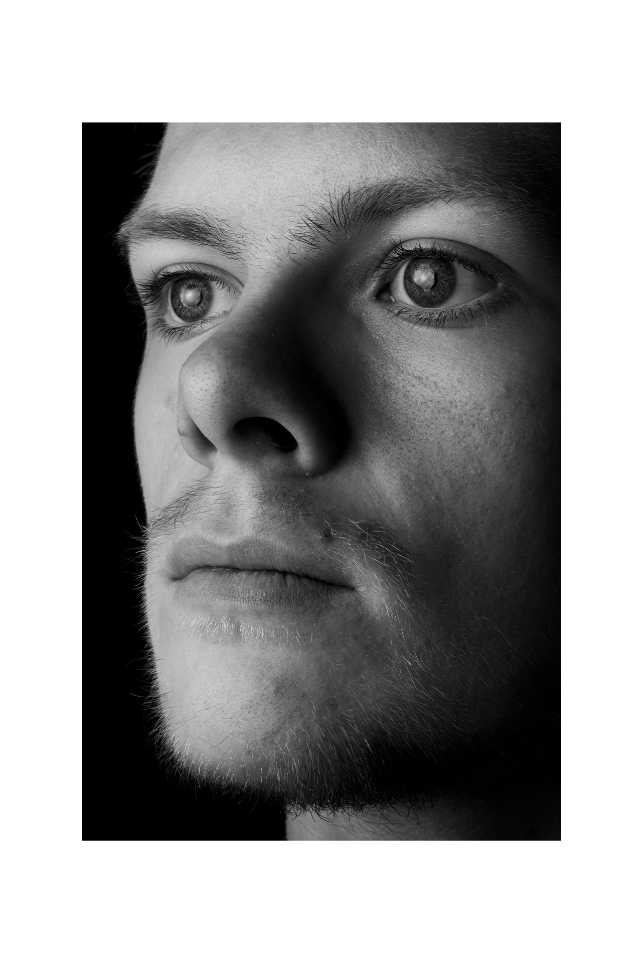
As you know, I felt that the image that I picked for Day 1 “could have been better.” I said this because I felt after having chosen the image and already published it, that the time spent afterward looking through my catalogue of files allowed me some clearer thinking toward the files I hadn’t chosen. Honestly I think the image I chose just doesn’t do what I think it should. For example, take a look at the images below.
Click to read...
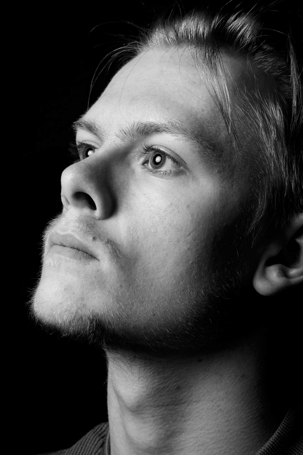
In hindsight, I really quite like this portrait, the composition feels natural and just enough to showcase the catchlight.
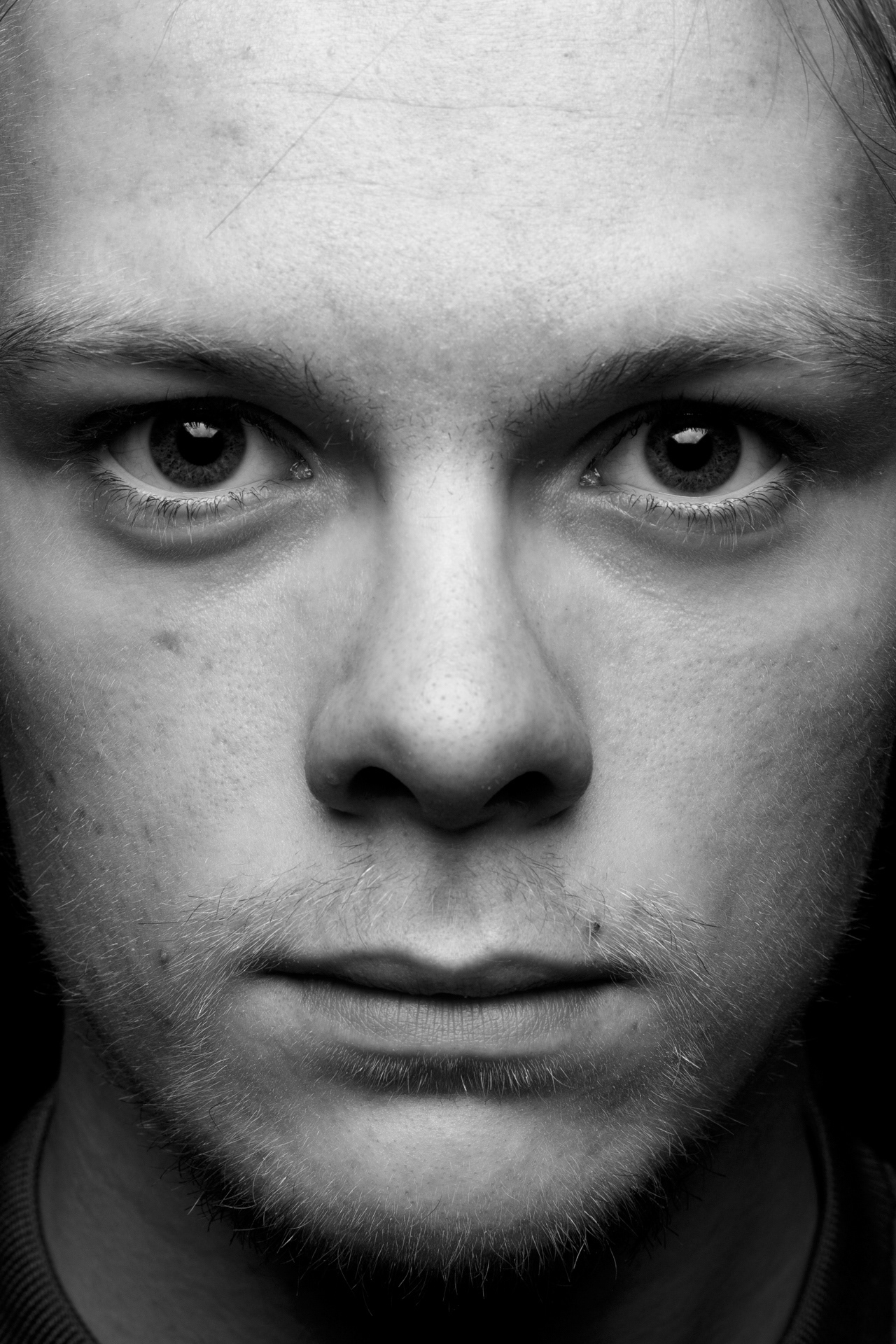
I WISH I chose this image. The catchlight is very well balanced, it’s subtle and only noticeable if you engage yourself but it dominates the image.

I wanted to talk about this image and generally discuss why I like the concept but wouldn’t choose it if I had the choice.
The first two images above are great. They each showcase and utillise the catchlight carefully but don’t overpower the image. The image I published for Day 1 did exactly that. I used the catchlight in a way that I believe is too much. The middle image is hands down my favourite.
Conceptually, the far-right image is really quite cool. I like the idea of the angle and perspective along with the 50mm lens translating into a technical 80mm because of the crop sensor. It works on paper but my execution was a bit poor. For a start, If the image was in focus, it would be alot more appealing. I also think the aperture would need to be MUCH higher to really capture the front to back sharpness. This concept was good though.
Day 2
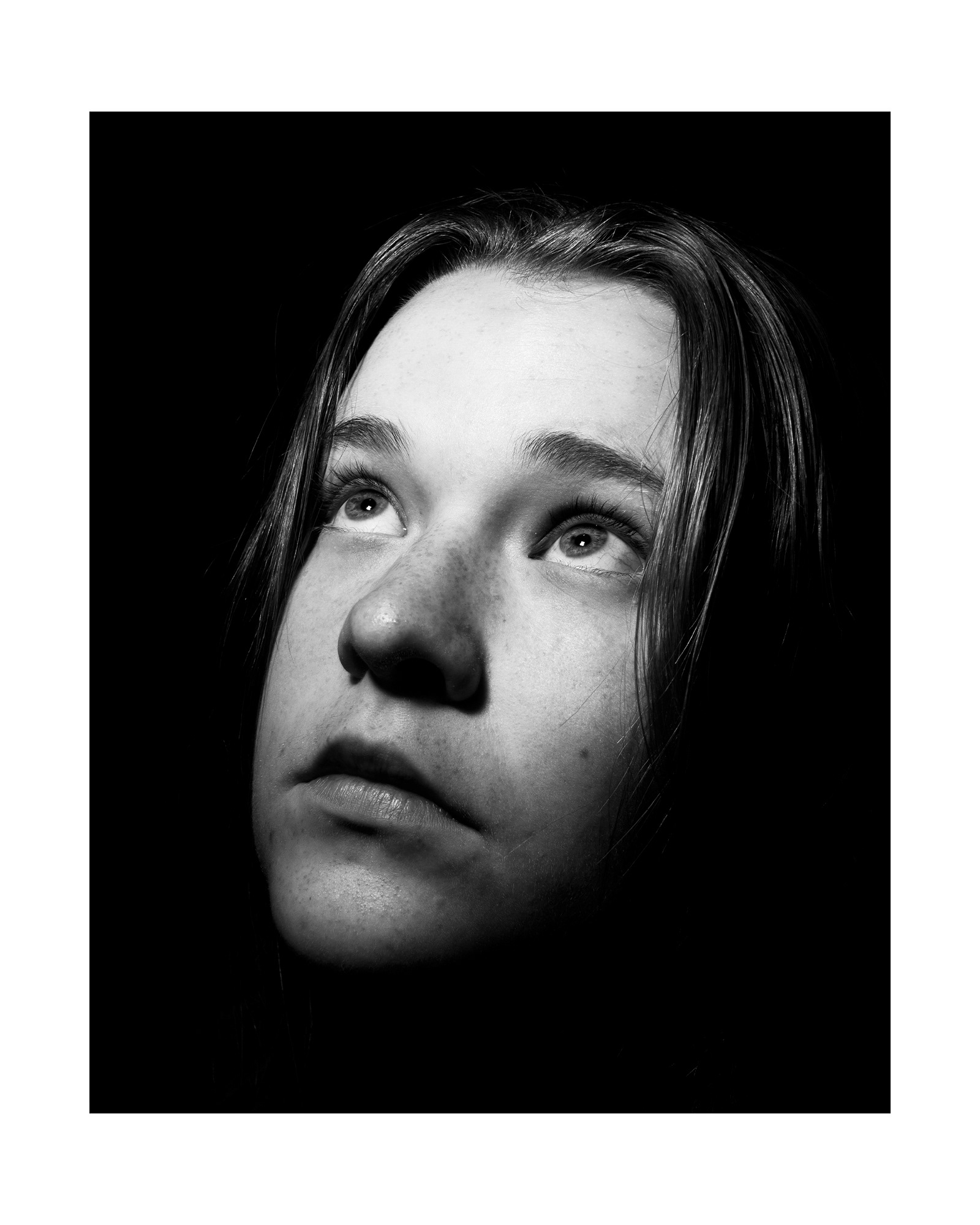
I love the image I chose. I think it was the absolute best choice from my entire catalogue of images. In terms of the images I didn’t choose, I felt they were good in their own rights but just not what I was looking for.
I think the image I chose just had the right position and really won by a few select details.
Click to read...

This image felt like it would suit a far brighter setup and enviroment than the one I took it with.

I really quite liked the aesthetic of this image but obviously opted for the one I chose. The composition is where this image lacked. I felt this image was naturally appealing when I looked at it. It didn’t do the portrait 100% justice. I LOVE the catchlights in this image though. They are amazing.
When looking at both of these images, they lack something. They feel slightly off balance. The left image would be far better in a different setting and the image on the right compositionally isn’t even. In the right image, I would move the frame a little to the right and ask Lauren to raise her chin slightly. I feel this would balance the image a bit nicer.
Day 3

The images I put aside for Day 3 were very difficult to choose from. I like all of these for varying reasons.
When it came to picking which image to represent the catchlight I was stuck between the published image and the first three images below. This was a tough choice but these images didn’t make the cut. I made the decision to cut these out because when I thought about the project as a whole I didn’t see these images alongside each other portrait, working with the project cohesively. On their own they kill it, included in the project they are just okay.
The catchlights in the first two images are an absolute smack in the face. the shape is bold and overpowers the eyes in all of the most appealing ways. They look alien. I LOVE them.(I’m considering publishing these because I like them so much). The composition is really interesting because the light itself was used as the object in the portraits, and it cuts through the image boldly. It’s the first thing I notice when looking at these images.
Click to read...
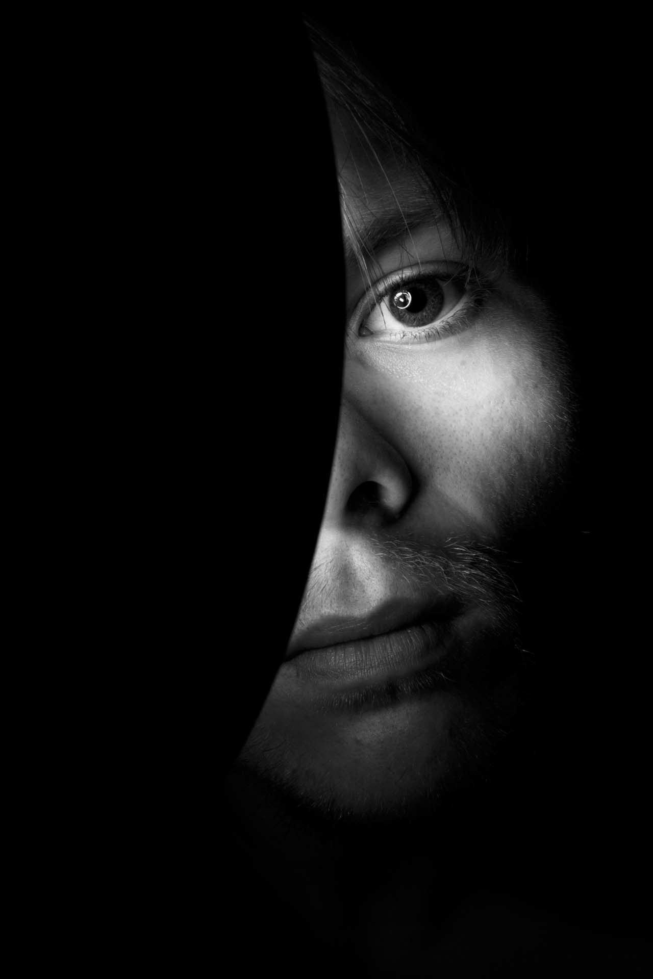
The catchlight here is hard to look away from.

I keep having the same issue with this portrait. I can’t look away...

I want to reshoot this image, only as a full-face portrait.

The last two images are an interesting dialogue on my self portrait work. The 3rd image represents showing only partially who I am, If I hadn’t replicated that feeling with the image I published I would have struggled even more to choose between this image and the final. I feel I did though, using my hand to cover my face. The fourth image didn’t feel as loud, It felt chaotic and the light hasn’t pooled in the way I would have liked to have seen in it. The catchlights don’t share much symmetry and I find that to be the downfall of that image. I wanted a portrait that caught my eye with a very bold look and that image just didn’t have that.
As you know, I chose the image I published because it has the bold appearance, the ideal balance of light and very symmetrical catchlights. Everything in that image adds together and creates a really strong portrait.
Day 4
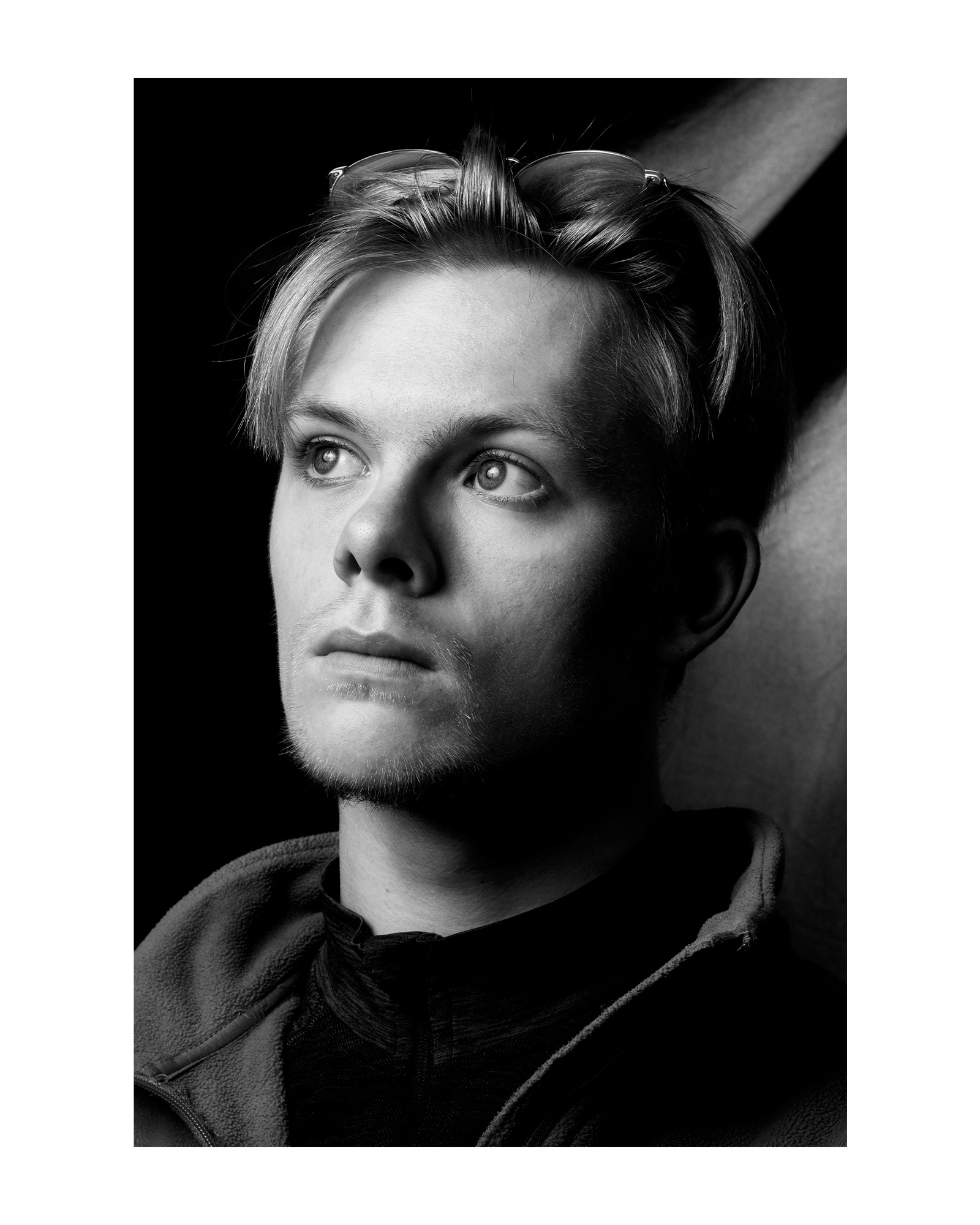
I don’t know where to start with this image. I honestly think the image I chose was such an amazing choice out of each of the images in my catalogue. I really love this self portrait.
In terms of the images that didn’t make the cut, I like both for very different reasons.
Click to read...
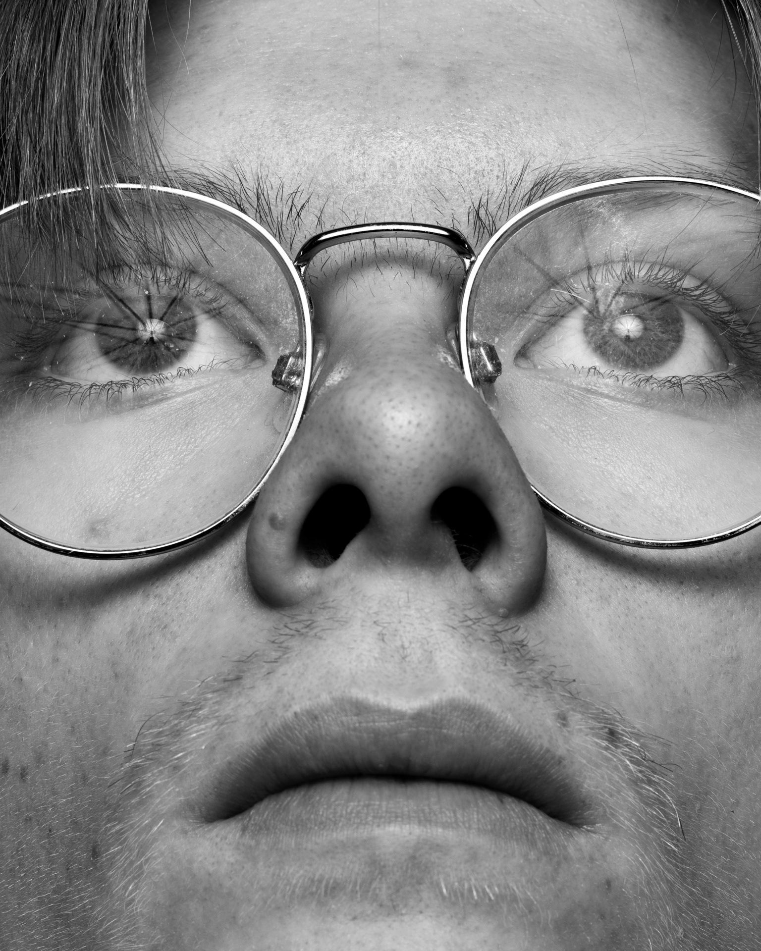
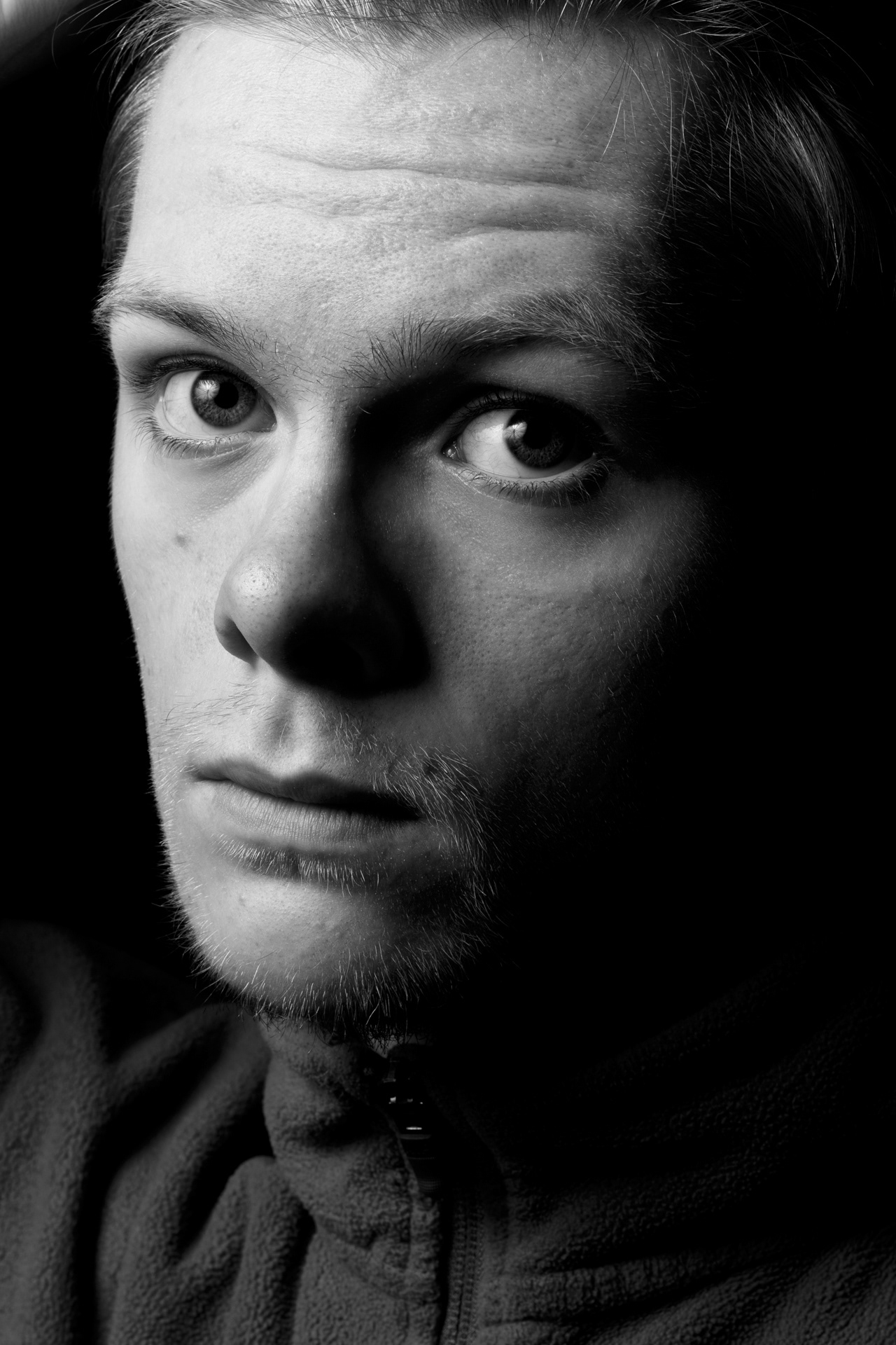
The image on the left feels very unnatural and makes me slightly uncomfortable. I don’t know if it’s the nose hair or monobrow, but it’s really revealing. I love the angle this was taken from and the catchlights this image had were just stunning. This image was all about experimentation and when I ended up creating the stunning reflection of the diffuser umbrella, I was so intrigued with the appearance of it. It was such an unexpected and really fun experimental portrait.
The second image was one that I found myself admiring. The way the light was falling on my face. The appearance it has is really satisfying for me. It itches a scratch for me. The quality of the shadows and light are really the type I appreciate in photography. It has deep contrast but not too much that the subject becomes invisible and the idea disappears, it’s just enough.
I ended up choosing the image I did because of the composition and atmosphere. I feel the two images above lack that. They feel aesthetic but lack atmosphere. the addition of the second light in the back really drew me into the atmosphere of the portrait. Ontop of this the form is so pleasing to me.
Day 5
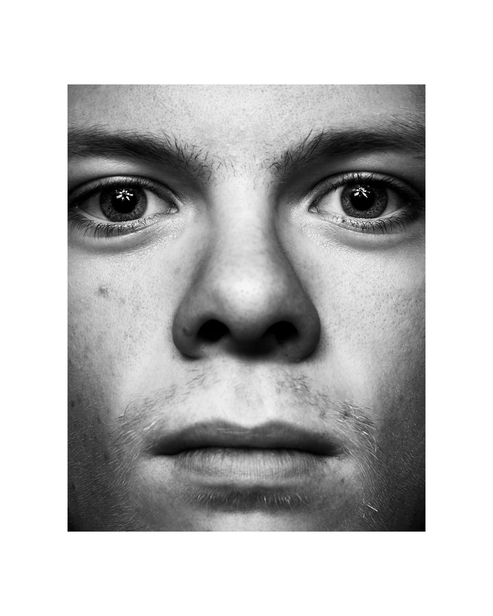
This image was really interesting. The catchlight that the silver umbrella produced was really surprising.
I wasn’t sure what to expect when I began but I was very surprised with the result. The specular highlights the catchlights have, are stunning. They dominate the portrait.
Click to read...

The reflections draw me into this image.

This catchlight is a great representation of why I did this project. I wanted to experiment. I wanted to show that process too.

Impressive forehead...
I found it difficult to choose between the first image and the one I published. The image that didn’t make the cut is really interesting. The reflection on the glasses and equal catchlights were very difficult for me to not choose. I really enjoy the framing and nature of the photograph. It is revealing but subconsciously the viewer isn’t immediately attracted to all of the revealing areas in the portrait so it feels less uncomfortable to look at. I really appreciate this image.
In the second image you can see a completely different but closer approach to the image. The catchlight in this portrait is mesmerising. I love the catchlight but couldn’t justify the use of the portrait in the project because I felt it differed from the rest too much…
In the final image you can see similarities to the image I chose to publish. This is where the concept came to life for the final image. In comparison to the published image I feel that there is too much forehead in the shot. (I don’t have a huge forehead, it just took up too much of the frame… or at least I keep telling myself that.) The image was also off-centre and my face was angled just a few degrees off to the left side of the frame.
Day 6

I found day 6’s image just okay and certainly not my favourite. I don’t feel that the quality of light in this image suits the portrait style. I have a feeling about this image that I can’t quite pinpoint. I generally like the relaxed expression and calm feeling from the image but I feel that the image could have been more. I am cutting myself some slack because it was a far more ‘unconventional’ approach, if there is such a thing.
Click to read...

I don’t like this portrait. I find it unappealing because of the shere lack of information and direction.
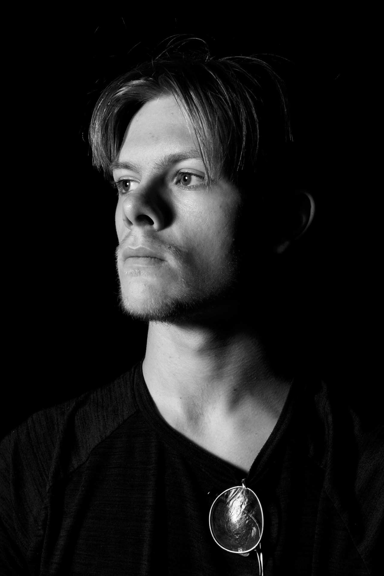
I find the reflection on my glasses really interesting.
These images are not ones that I feel proud of at all. When I see these I think of something I was told by a photographer who is well established in the industry, John Young. He told me “You are only as good as your last photograph.” I try not to live by that when I’m struggling because I find it can determine everything I do for all of the wrong reasons. I do, however, try to follow that mantra where possible. When it doesn’t determine everything I do, and consume my life, it is an incredibly rewarding feeling knowing I really tried my best at something.
I’ve generally been finding more freedom in the admittance and openness of my failures. When I own them, I feel much better about what has happened. It’s a really great sense of relief. If you struggle with that, try it. The next time you find yourself feeling down about something you could have done better at, or even in the loop of “I could have done this better…” talk to someone about it, and openly admit you missed your target. Just talk about what you have done, even if it isn’t great. It normalises the process of failure and allows acceptance to creep in. (This is something I am having to learn slowly...)
Back to the photos…
In the images above I see images that lack much information. They just don’t achieve the goal I had, before I started that day’s shoot. I wanted to capture a self portrait and showcase both the figure of me and the catchlight itself. I found I only caught the catchlight and didn’t achieve my other two objectives. I felt the image I published stood for those ideas better than the rest of the images I took.
(Proof Read Note)
I actually quite like the image on the right. After having taken a break from this image for a while I like the framing most.
Day 7
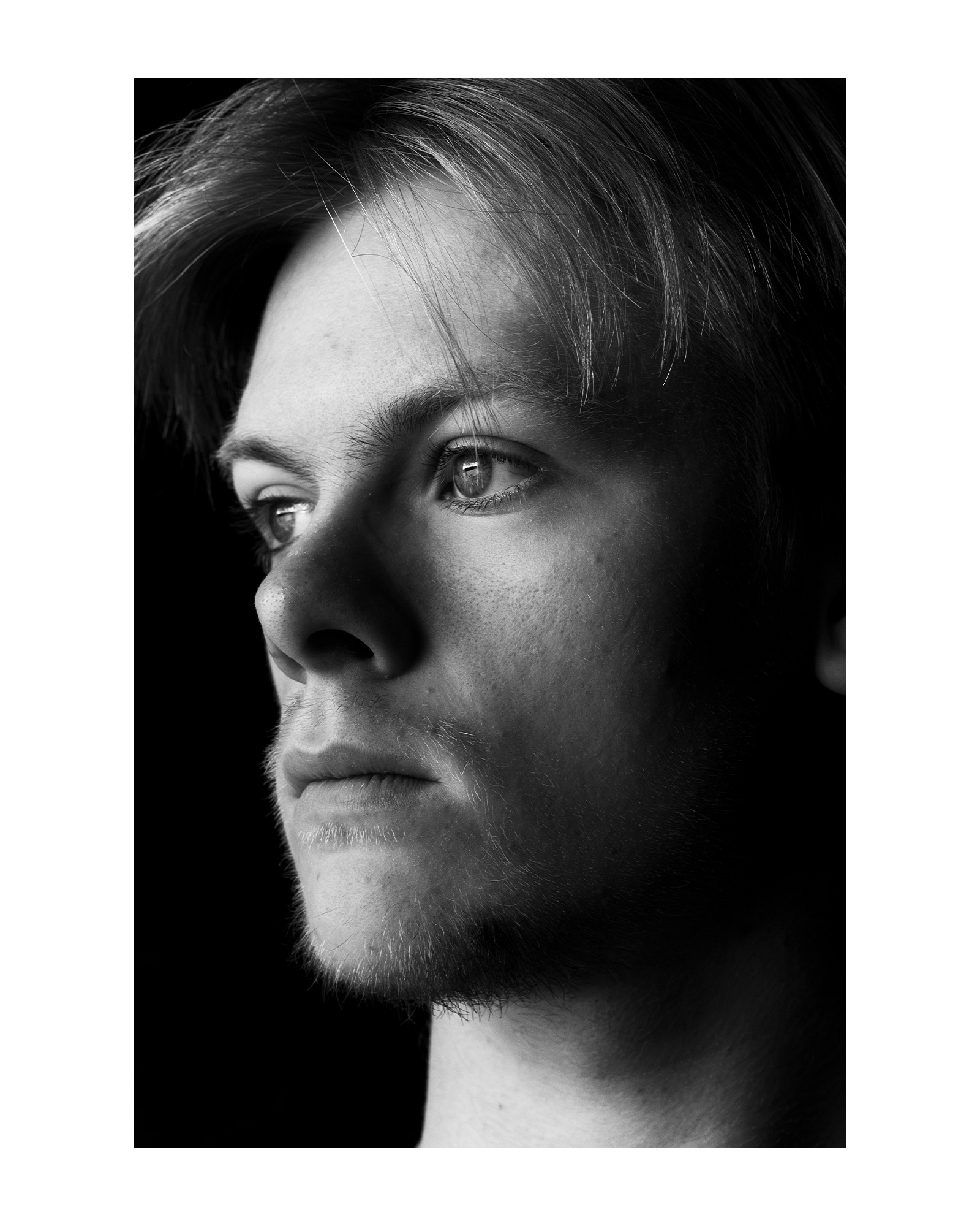
Day 7’s portrait is one of the nicer portraits I think. The quality of light from the natural window light was really soft, I made a portrait that I can and do really appreciate. The image that I wanted to talk about that didn’t make the cut was a tough image to disqualify.
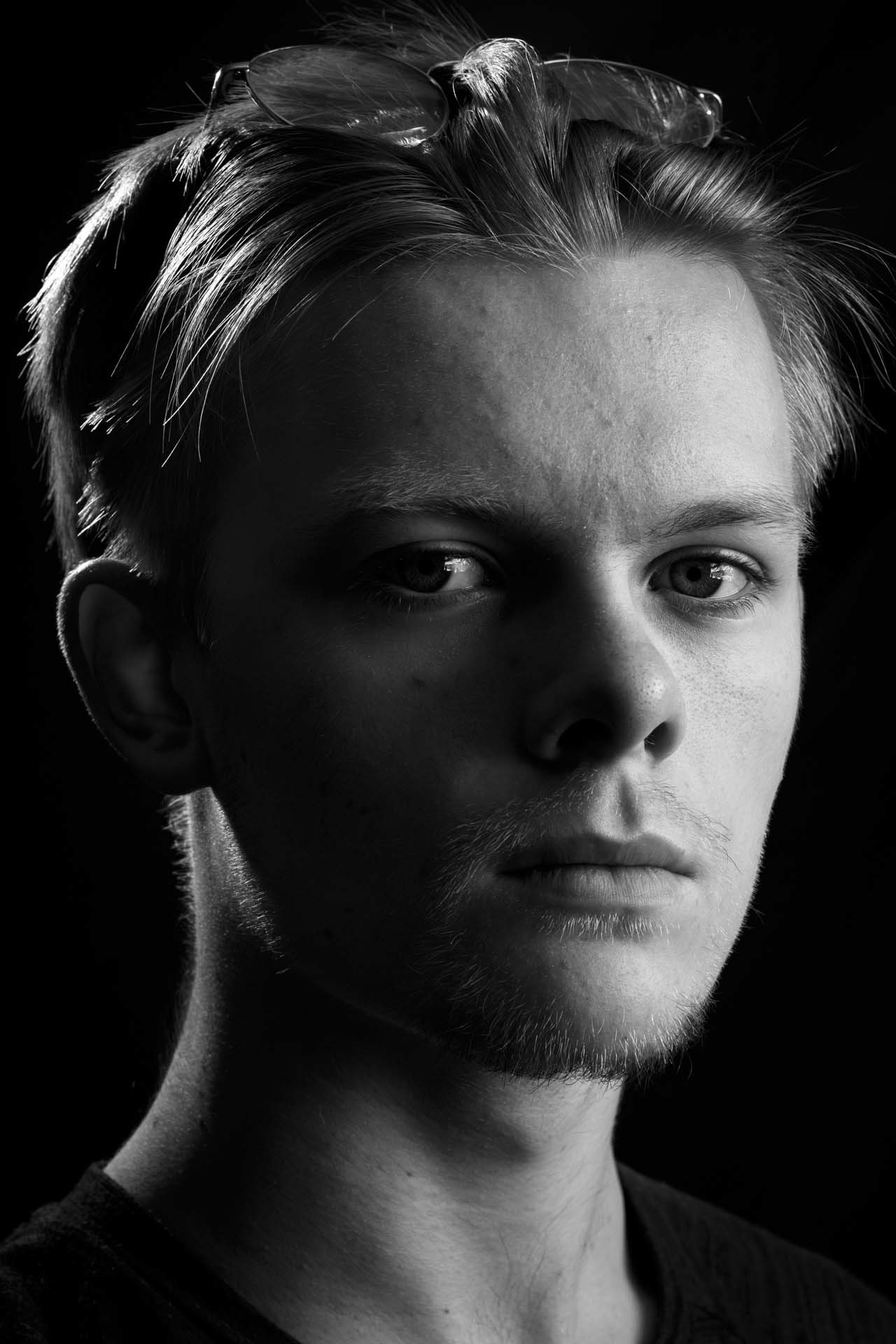
This image was very different from every other portrait I have shown and spoken about through the project. The main difference was that I lit this image from the right side of the frame, unlike the rest of the images(Other than day 5), which have been lit from the left. The whole project was very specifically made only lighting each portrait from the left side, and in this portrait, I wanted to mix it up. On top of the natural light and directional switch, I also added a hair-light, lighting my head from the left to show form on the head.
I find this portrait conflicting. On the one hand I like the concept and execution a lot but it lacks clear catchlights. This was the reason I cut this image from the project. If I were to reshoot this image I would have changed the layout slightly. Below you’ll see 2 lighting diagrams. The first is what I did. The second is what I would do if I were to reshoot.

This slight change in angle would have caused the catchlights to land on the iris and make them far sharper. The hair-light would stay the same and the camera would shift slightly. This would make all the difference for the image and the outcome would possibly have resulted in a different image being published...
Thank you for joining me on this journey.
I hope you are in a safe place mentally. If you aren’t, don’t be ashamed to start talking. Reach out to someone.
A.W.H